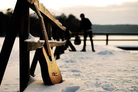
Something like this layout would be good idea, as it links within the lyrics 'bloodstains in the snow' and the imagery also shows a guitar, which is the main instrument that the artist, and also his entire album uses, which allows audiences to understand the link between the artist and his merchandise


By using a template such as this, it allows me to still link towards the conventions, for instance, the male and female are seen in a loving embrace in the woods and she is holding flowers, which links to the narrative (love) and also the key conventions found in an indie pop music video (elemental areas)

My idea, if I was to use something similar to this image, the song list would be placed on the right hand side, with the lovers on the left, leaving the Cd to be in the middle, which would be on the back ground of the woodland area, still keeping with the conventions. The font would be something easy to read ( Such as Courier) in black ink, because the design in rather important within this music video, and therefore I would like my audiences to be drawn to the imagery before they are greeted with the song list (the songs would not be the examples I have used, I was rather hungry when I created this)
No comments:
Post a Comment