Friday, 28 November 2014
Tuesday, 25 November 2014
Final Digipack idea

I decided to use these photos because, although I did not shoot near a small river, I did however use this for my final music advertisement, meaning that I have created a link between digipack and music advertisement just as the artist did with his debut album 'All the little lights' and recently 'Whispers'
The photo also fits with the generic key conventions of the indie pop genre my music video follows.
The use of the signpost saying 'Back Lane' on the extra panel, I thought looked very nice and as it the only photo with an effect, it stands out and shows connotations of the place to be significant, (which it is because it's the last road sign leading into my location) I know however that my target audience will not know this (unless they live locally) meaning that I believe the use of this photo will make the audience look at it twice as it so out of place with all the nature, which shows the audience connotations of significance and that the road sign could link in with the artist or the narrative to my music video. It also lets the audience imagine what the sign could be in relevance to, allowing them to within the fantasy which is my music video, to create their own links and own assumptions of my narrative, which as an audience member would make the music video memorable which also leads to more viewings of the video, which ultimately would lead to sales of the song and album, concluding to be positive with the artist and his label.
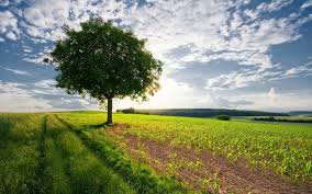
The other photos (back cover and front cover) were shot on location. The back panel I chose to show part of a growing tree because the song itself 'bloodstains' is the exact opposite as it talks about how their love is ending and they know it, '...our love, let us on the go...' I used this because it challenges the lyrics so audience members can listen to the music and understand the lyrics with the emotions behind them, to then relate them to their own lives and misfortunes, and when they close the digipack, they can see the healthy growing tree which would show them connotations that sometimes we need to let things go in order for new things to grow. Just like the circle of life...
The final photo, is taken from a point of view shot which already allows the audience to feel welcomed to the digipack, as though the song is going to be relatable and personal, which connotes that the artist's song itself is very personal. It also sets the front panel well because, not only does it fit with the conventions of a indie pop genre, but it also shows a pathway with darkness in the distance, which shows connotations for the character of the girl, and that she is walking to a dead end, which is also foreshadowing the outcome of the music video, and also the lyrics '... To break our hearts'
However, having now gaining feedback from my digipack, I was informed that there is no apparent link to the song or even my locations for the audience to understand and recognise from first glance. I have now decided to change that and apply different photos of props used within the music video, such as the photo of the two actors with candle wax, or even blood (fake I mean... I would like to gain a higher grade but I don't feel comfortable splitting a vein for it.)
However, having now gaining feedback from my digipack, I was informed that there is no apparent link to the song or even my locations for the audience to understand and recognise from first glance. I have now decided to change that and apply different photos of props used within the music video, such as the photo of the two actors with candle wax, or even blood (fake I mean... I would like to gain a higher grade but I don't feel comfortable splitting a vein for it.)
Final Music Advertisement Idea

This is my final music advertisement.
I chose this picture because, although it doesn't link in with the footage within my music video, it does however link with the generic genre key conventions of a 'indie pop' music video. I decided to use a white colour for the text because it is easy to read, and also it stands out behind the background. When looking at text, I decided to use little information because then it will allow audience members to create a hype on their own by following the only source ( @passengeroffical) they have to gain the little information they can. This also allows the music advertisement to have below-the-line advertising, which also links to the artist because that is what Passenger would have to rely on before the hit release of his two well-known albums, which appeals to fans and audience members who knew of him before his debut albums, by reassuring this fan-base that he has not changed.
By doing this, it has allowed me to understand the importance of music advertisement's and just how much work goes into it.
Just like my digipack, it was pointed out to me that there is no apparently link to any of my products for the audience to understand. So I have decided to change the entire music advertisement to fit in with the rest of my products, so then the audience can notice the apparent link and understand why I have used what Image for where.
Thursday, 20 November 2014
Shotlist for my digipack
When looking at what shots to use for my digipack, I decided that I should use a variety of shots, so I did.
I decided on:
Establishing shot- this would spread out to create the middle three panels with the CD to sit in the middle, I thought that this would work because it allows a beautiful picture (if I do say so myself) and it sets the tone of the album for the audience to be relaxed and mellow, just like the artist himself.
Medium shot- I've used this shot for a few of my photos because it's mostly of wildlife which fits with the brand of artist passenger (as he is always seen with elements around him) and also the key conventions of his genre (indie pop)
By doing this, it has allowed me to know exactly what I want for my digipack and allows me to save time, as I will not be fussing around trying to think of shots to use, as now I know what I want and where I want to shoot it, which is on location.
I decided on:
Establishing shot- this would spread out to create the middle three panels with the CD to sit in the middle, I thought that this would work because it allows a beautiful picture (if I do say so myself) and it sets the tone of the album for the audience to be relaxed and mellow, just like the artist himself.
Medium shot- I've used this shot for a few of my photos because it's mostly of wildlife which fits with the brand of artist passenger (as he is always seen with elements around him) and also the key conventions of his genre (indie pop)

By doing this, it has allowed me to know exactly what I want for my digipack and allows me to save time, as I will not be fussing around trying to think of shots to use, as now I know what I want and where I want to shoot it, which is on location.
Wednesday, 19 November 2014
Equipment infomation
When I come to make my music video, it would be good to be organised, as well as prepared to film, which would mean knowing exactly what I will be using, and for what.
Therefore I have created a list of what I will need, when I will need it, and when I will be using it.

Therefore I have created a list of what I will need, when I will need it, and when I will be using it.
By doing this, it has allowed me to get myself organised for when I come to film, which will aid me
whilst filming as I will be able to know exactly what I am doing, meaning I shouldn't have to re-
film.
Shotlist for my Music advertisement (plus draft)
For my music advertisement I decided to use an establishing shot of a woodland area in order for audiences to understand that I have paid attention to the key conventions of my chosen music genre.
Although there is a lamp post in the middle of the frame, as this is an advertisement I'm able to place text about the single, the artists name and other information that I would need to allow the audience to know in order to let them be interested with the single, and for them to be excited enough to start their own hype.


Although there is a lamp post in the middle of the frame, as this is an advertisement I'm able to place text about the single, the artists name and other information that I would need to allow the audience to know in order to let them be interested with the single, and for them to be excited enough to start their own hype.
This is a draft for my Music advertisement:
I decided to not reveal a lot of information on this advertisement because I thought that I would then allow audience members to 'follow' on social medias and create their own hype.
Shotlist for my Magazine (plus image i would like to use)
When looking at what would be best for my magazine shot list I looked at some current magazine articles to get a better understanding of what I could be faced with.
From my research what I found was that they all contained information of the single/albums release and also the download date and where the audience could download it from.
The shots used within these were mostly long shots and establishing shots, which then lead me on to thinking that, if I wish to achieve the best possibly grade for my coursework, I should try and match my work as closely as I can to that of a professional piece of work.
I chose an establishing shot for my music magazine because I thought with what is in the frame, e.g. the sunset as well as a location that audiences can relate to (a neighbourhood) I also think that this picture links well to the rest of my work because I have still taken into consideration the key conventions of my chosen genre, and also I've given the audience the room for interpretation.
For example, the audience can look at this photo and wonder
"Why are there two houses opposite each other?"
"Is this going to have something to with the artist and where he grew up?"
The reason why I have chosen this picture is because I look at the two opposite houses and I think of Romeo and Juliet, and how they were divided but they ended up being together in the end, I think that my narrative shows connotations that love is a strong force and can be seen to will people to do many things, and can be the cause of happiness.
The sunset I though was key because to the far right of the picture the clouds look dark and grey showing connotations of despair and pain, whereas nearer to the centre and far left, the sun catches the clouds and creates beautiful colours of orange and gold which shows connotations of happiness and purity, which can be seen to reflect the woman's perspective of the narrative. She goes through pain and suffering with her husband's death, but when she has passed, she has passed the darkness in her life and is reunited with her lover, which can then be seen to relate to the beautiful colours of orange and gold.

Monday, 17 November 2014
Audition infomation

For this audition, actors are expected to lip sync to the song provided, and also entail screen tests, which would include close ups, medium shots, and also long shots. The actors should also be aware that they are expected to act along-side another, and also to be intimate with this other (for instance acting in love in certain scenes.)
The auditions are to be held in December the 4th between 12-4 as some who wish to audition may not be available outside of working hours. Auditions will be held at 'the old court theatre' located in Chelmsford, as it is more accessible than other locations.
I spread the word about auditions through social media and also local theatre groups in order to get a variety of people to audition instead of just asking my friends to do it because it would be less hassle.
These auditions will aid me with my work because, although it may be easier to just ask my friends, by auditioning, it allows me to then have a better choice at those who may suit the music video better, it also allows me to have better access to those who find lip syncing easier, because if I had just asked my friends, lip syncing would be hard, as they do not use their mouths very well.
Friday, 14 November 2014
Auditions
Male auditions:
First: Peter Godwin
Second: Ryan Chapman
Female auditions:
First: Lauryn Dobinson
Second: Mollie Allen
Chosen cast:
Male: Ryan Chapman
Female: Lauryn Dobbinson
I have decided on this cast as both these actors were by far the best for lip-syncing, which personally is better as it will make my job easier when I come to editing. They also fitted my ideal casting choice, which was a bonus, the only dis-advantage is that they have never met each other, which could affect their acting as a couple when filming. However, knowing both of the actors well, I would hope to think that everything will be fine, and they will not look as awkward as they possibly will feel.
By doing this, this has allowed me to have the directing choice of who I cast and not, meaning that it shows confidence in my decisions, and that I have thought and planned my choice in actors and not just asked a friend to do it.
Lighting my music video
As most of my locations are exterior, I will be relying on the natural lighting in my locations, meaning that I will have to know exactly when the sun will set, reach dusk and also when it will be at full light in order to film to the best that I can.
 I plan to film around midday, as it will the sun to be at full capacity, which would then allow my shots to have the amount of lighting needed to create the contrast within my narrative (for instance, in the reality shots, I want to use low key lighting because then it shows connotations of the woman's depression of her husband's death, and also then shows, in the flashbacks with the high key lighting, how everything was fine when he was alive.)
 I plan to film the exterior shots in two days as for some shots I would like the lighting to be a little more warm (yes I know it sounds silly as I'm, talking about the suns natural light being warm) but by using dusk for the final shots (when she has joined him on the other side) it shows connotations of warmth and passion and is the sort of lighting that one would use in romantic films, which is what my narrative is in some way, a short film to accompany the soundtrack 'bloodstains'
- I know that I sounds silly filming exterior on two days when I can just film to the schedule of the sun, but as I am relying on natural light, if it happens that it rains on one of the days or is cloudy (touch wood) then I will have another day to then shoot and/or re-film shots if needed.
I plan to film around midday, as it will the sun to be at full capacity, which would then allow my shots to have the amount of lighting needed to create the contrast within my narrative (for instance, in the reality shots, I want to use low key lighting because then it shows connotations of the woman's depression of her husband's death, and also then shows, in the flashbacks with the high key lighting, how everything was fine when he was alive.) I plan to film the exterior shots in two days as for some shots I would like the lighting to be a little more warm (yes I know it sounds silly as I'm, talking about the suns natural light being warm) but by using dusk for the final shots (when she has joined him on the other side) it shows connotations of warmth and passion and is the sort of lighting that one would use in romantic films, which is what my narrative is in some way, a short film to accompany the soundtrack 'bloodstains' - I know that I sounds silly filming exterior on two days when I can just film to the schedule of the sun, but as I am relying on natural light, if it happens that it rains on one of the days or is cloudy (touch wood) then I will have another day to then shoot and/or re-film shots if needed.
Tuesday, 11 November 2014
Final choices (props, costume, location etc)
When looking at props, I only chose to verbally talk about the 'main' ones I would be using, however there are a few more that I wish to point out.
Props:
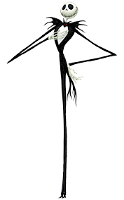
I chose the Jack Skellington mugs because, as they shows connotations of death and he is a walking, singing skeleton, which highlights to the audience that there is death involved within the music video, for both characters.
Costumes:
I also chose for my female to be in all black for the lip syncing because it shows connotations of death and morning, which she experiences just not in that order.
Friday, 7 November 2014
Ideas for my music advertisment
By using this style of music advertisement, it allows me to spread out the information that I would like to give out to the public, and it also keeps the genre conventions throughout (from the music video down to the lyrics)
This image also allows the audience to have open interpretation to what the music video and the album could then have featured, for instance this image looks as though everything is fine, however there is a shadow which could allow audience to think that possibly not everything is alright, meaning that they have an idea of what the music video will entail.

My font would be quite normal and easy to read (not comic sans, but something along the lines of Courier as it is easy to read...)
Also I would have the text in the colour black as it contrast the high key lighting and lighter colours of the background, which would draw the audience to the text therefore they are more likely to read my advertisement instead of one which the text basically fades into the background.

I would like to use an image like this for my music advertisement as it is still a subtle hint towards the main locations of the music video, and also the themes, for instance I bet you immediately thought of passion and love when you looked at the rose, and then thought about where the rose came from, for instance a tree, In a field (see it does link)
This also allows me to have my text, for instance on layout of this images (I will not be using this image)
I could have little information dotted around the rose, the information would be enough for audiences to understand what is going on, but it also conceals enough information for the audience to then create a hype as they would want the information that the record label will not release.

So for instance I would have the layout like this, the font as well I would have in white as the song talks about 'bloodstains in the snow' and also how my characters will be dressed in black and white, it also links towards the digipack, music video, lyrics and also now the music video advertisement.
Wednesday, 5 November 2014
Ideas for Digipack
Here are some ideas for my own music video, these images were taken from Google images, however these images are not the images I will be using when it comes to my actual digipack, these are just templates for what I want to use.


I could use something similar to this for the design of my digipack because the music video is mostly set in fields, and also wooded areas, which would then mean that the music video would link to the digipack, therefore keeping a theme constant through the merchandise and promotion of the artist.
An image just of the wooded area (which would be the same as the area we film in) could also work because it would be a relatable location which the audience would recognise from music video. This would also work with the conventions of the artist and the artist's genre, which again would be keeping with conventions that the audience are used to, meaning that they can establish from this design what type of album it is going to be.
However with the design, I could go against the conventions of the genre, for instance the link between woodland areas from the music video and digipack design, to then allow the audience to understand different elements of the music video, for instance, by using a design like this, the use of old fashioned pictures, it also links with the use of home videos used within the narrative, and the pictures I would use would be of the characters being together, so then audience members have another insight into the narrative of the music video.
By doing this, it allows me to plan ahead as to what would look good as a design, instead of just taking any old image, which would most likely have no relevance to the music video genre conventions or even the narrative.
Tuesday, 4 November 2014
Animatic Storyboard
Because my music video repeats most shots, I have picked the most used shots and also the most unique shots to show within this animated storyboard.
By doing this, this allows me to understand how editing my final piece will feel like, and also how my final piece will look like *In regards to my variety of shots* meaning that if I wanted to change anything, I would be able to change now without having to rush around at the last second.
Monday, 3 November 2014
Location Scouting ( Interior )
Location one:


Location two:

This location could also be used for the interior locations, and looks to have more room than the other location explained above. However I must take into consideration that the walls are painted green, which the colour can affect what I pick up on camera.
Location three: (final)


I have decided on this house for location because I believe that it shows connotations of a warm and welcoming home, which will make sense in the flash backs, and also how depressed she is when we show the reality, due to her welcoming home, now full of doom and gloom.

The colours used in this house are more neutral and do not stand out as much as the green in the other location.

This location also gives me room and enough for lighting to be created properly, and also for me, my actors and also my equipment to work and move easily around.

Location Scouting ( exterior )
.jpg)
.jpg) These locations are from London, and would then allow me to create a very realistic location for the audiences to react to, I worry however, that if I choose this location, that it will then take away from the overall convention of an indie music video to be plain and simple, and also within basic locations such as woodland areas.
These locations are from London, and would then allow me to create a very realistic location for the audiences to react to, I worry however, that if I choose this location, that it will then take away from the overall convention of an indie music video to be plain and simple, and also within basic locations such as woodland areas. 
This location looks to be a good candidate as it follows key conventions of my chosen artist and also the music videos he creates.
 Again this style of location could work perfectly with the music video, however I fear that, as it is not a full woodland area, and only a pathway, when I look into framing, I would catch things in the frame that shouldn't be there, for instance, there is a lamp post already in the photo, and a building in the background.

These locations are from the same area, and look idea for certain parts of my music video narrative. The locations also fall into the conventions of my chosen artist's music video, which is a bonus because I wish to convey my knowledge of conventions, and I wish to apply them to my work.


By using this location, it could allow me to portray the characters in a high level of verisimilitude, which would then allow the audience to emphasise with the characters, for instance the wife.
Final locations:
By doing this location scouting it allows me to get an idea of where I can realistically film so when I do come to filming, I'm not just rushing around last minute looking for a space to film.
Sunday, 2 November 2014
Props Infomation
Within my music video I will be using various props;
Cardboard box: to be used in the reality as she is packing up his things

Husbands items: these will be personal items, such as a watch, paperweights, photos etc...

Ring: to be worn by the female

Hand held camera: that the male holds in the flashbacks

Photo: The female picks this up which leads into a flashback

Glass: For the female to drink out of
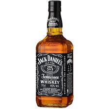
Bottle of Whiskey: Which will be filled with apple juice for impact towards the narrative.
By doing this, this allows me to have an idea of what is going to be in my frame when it comes to shots, and therefore allows me to add or take away from the mise-en-scene so then my music video can look as professional realistic as possible.
Cardboard box: to be used in the reality as she is packing up his things
Husbands items: these will be personal items, such as a watch, paperweights, photos etc...
Ring: to be worn by the female
Hand held camera: that the male holds in the flashbacks
Photo: The female picks this up which leads into a flashback
Glass: For the female to drink out of
Bottle of Whiskey: Which will be filled with apple juice for impact towards the narrative.
By doing this, this allows me to have an idea of what is going to be in my frame when it comes to shots, and therefore allows me to add or take away from the mise-en-scene so then my music video can look as professional realistic as possible.
Costume ideas and infomation
Female costume:
The females costume I have decided again to have her in autumn clothing for most of the exterior shots, as that is the season I will be recording, and it would silly to film in summer clothing. The wife has many costume changes, as she changes from autumn clothing, to summer outfits (different dresses and skirts) and these costumes change with every location.


I've decided to have the husband and wife to then join together in the same costume, for instance black jeans and a white top in their final costumes to symbolise Ying and Yang, because they are both finally together, it also has connotations of unison if they are both in the same set of costumes.


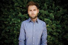
Male's costume:
I have chosen these costume ideas for the role of the 'husband' because I believe that they are casual costumes which would suit the style of character, for instance the husband was basic, and lived a normal life, so by having the character dressed in casual clothing, It means that the audience will be able to relate to the character, instead of wonder why the basic character is in a costume that does not suit the genre of style of music video, for instance a penguin suit.


By doing this exercise, it allows me to then have an idea of what I want my characters to look like, so then my actors are not just turning up in whatever they please. It also allows me to explore how much a costume can affect the piece, for example colours.
Subscribe to:
Comments (Atom)